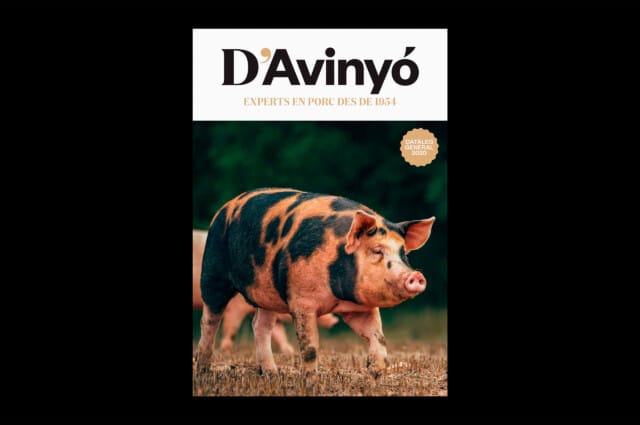
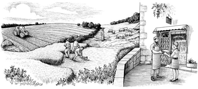
Conceptually, all elements revolve around the nature of the customer: the importance of origin and tradition combined with innovation and quality. That is why the name of the group changed from Roma to D’Avinyó. The apostrophe conveys a connection with its territory and the tradition and quality that this brings with it.
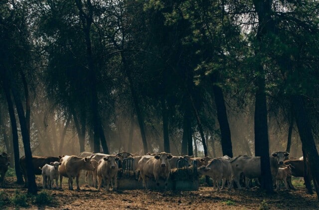
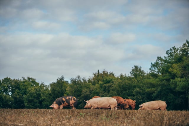
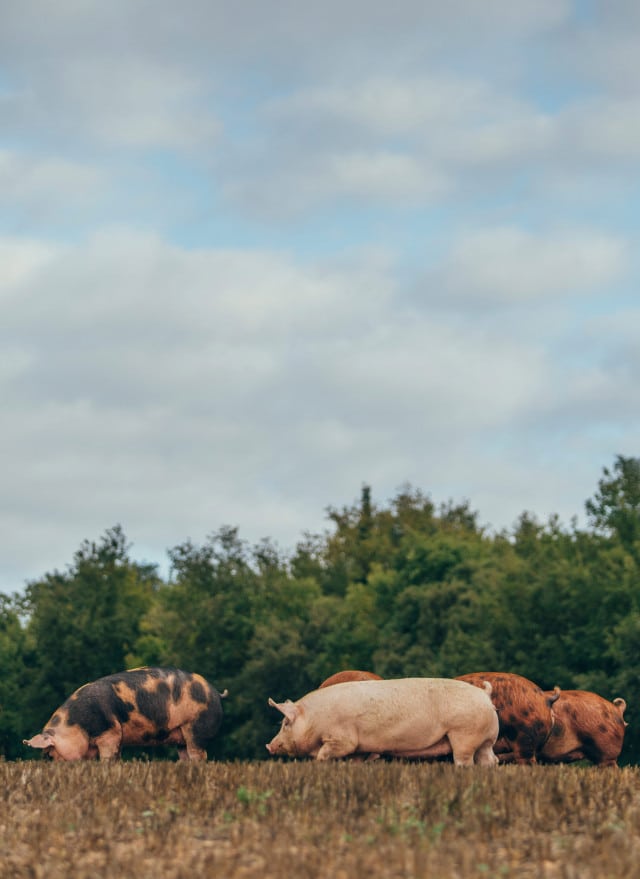
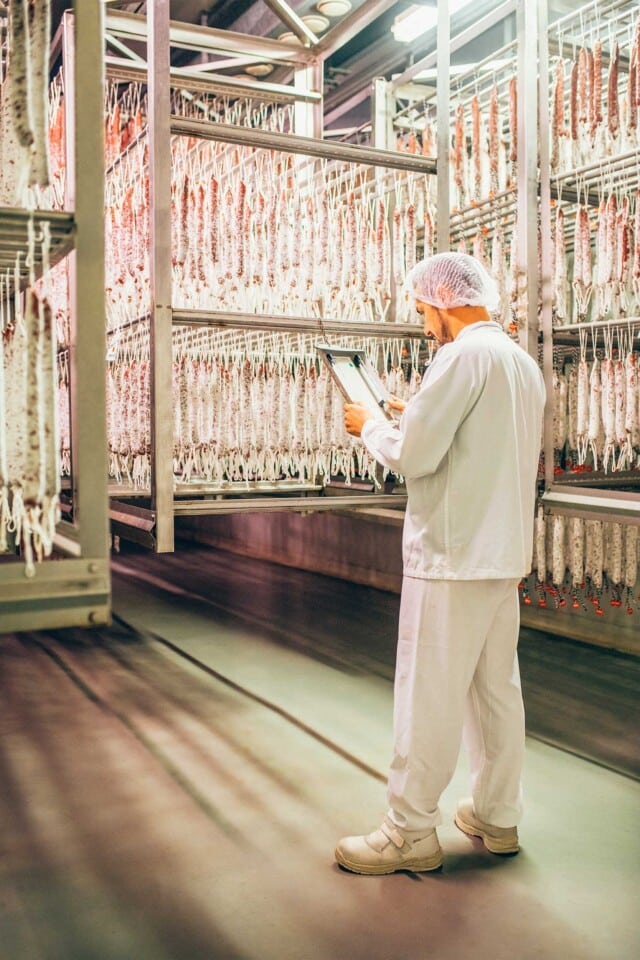
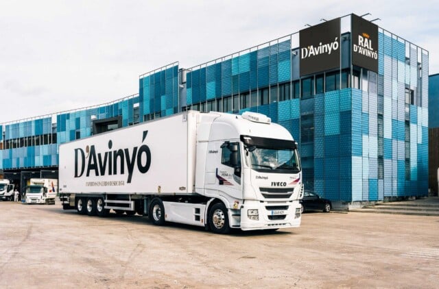
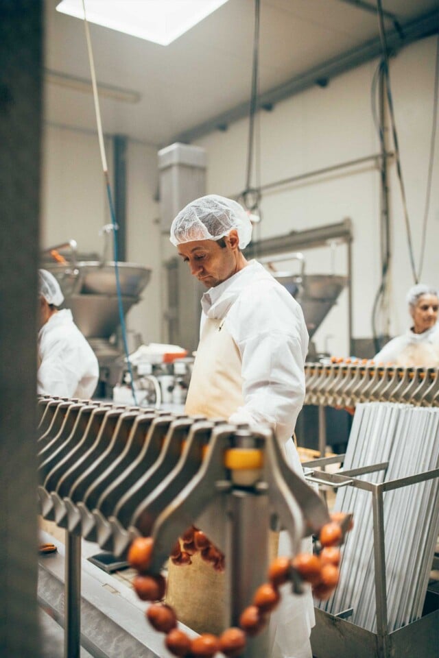
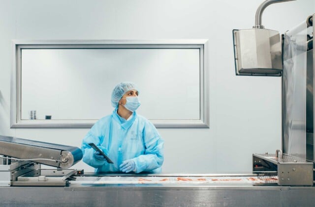
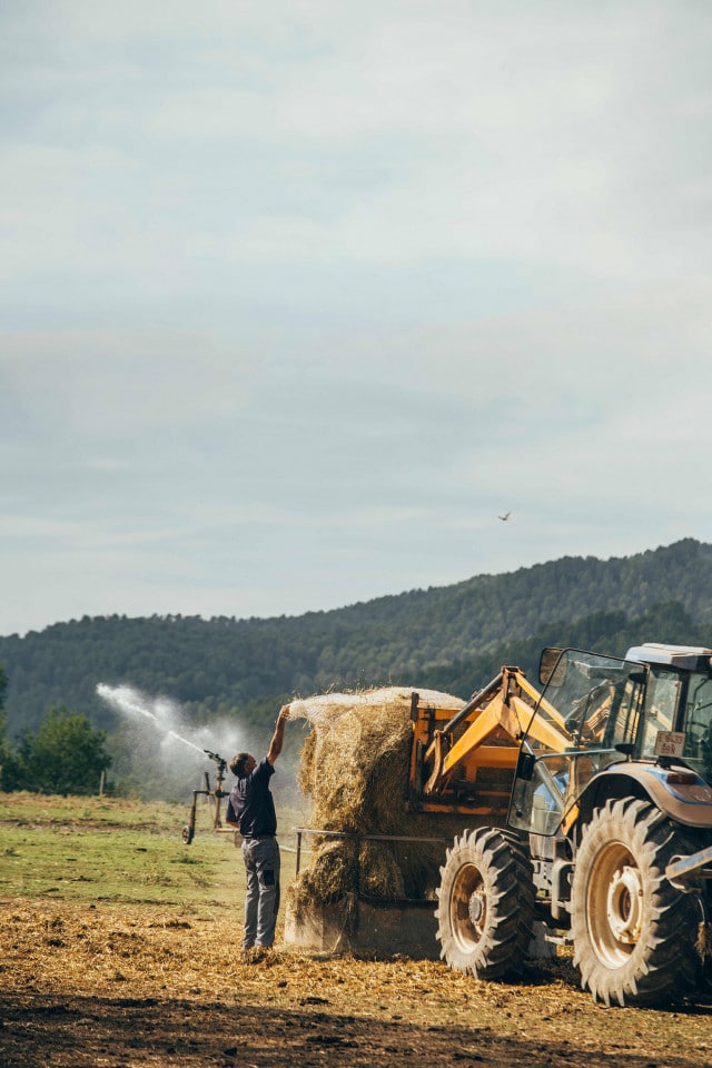
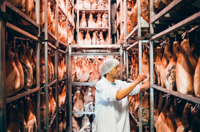
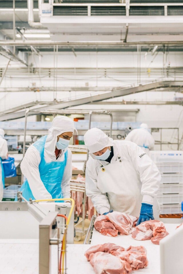
Respect for the origin, the environment and tradition, combined with a great investment in innovation and sustainability, result in a quality product that puts the consumer at the center and, at the same time, encourages responsible consumption. The group also includes farms, abattoirs, processing and transport plants. That is why we redefined its positioning as a group and as a brand at the same time.
The graphic language combines two typefaces: Founders, a sans serif grotesque font, heir to the signs of the beginning of the 20th century; and Domaine, a condensed roman typeface, which brings distinction and quality.
The graphic language combines two typefaces: Founders, a sans serif grotesque font, heir to the signs of the beginning of the 20th century; and Domaine, a condensed roman typeface, which brings distinction and quality.
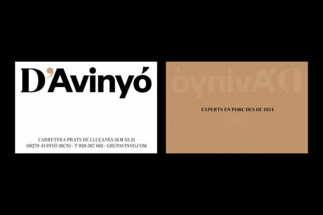

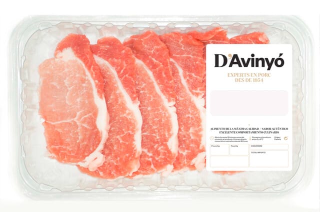
In brand applications, such as packaging, the use of white, combined with black and gold convey traditional knowledge with the effectiveness of new technologies.
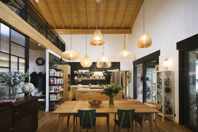
The website is a portrait of the universe of D’Avinyó: the history, the product, the family and the values. The typographic treatment, the tone of the content and the prominence of the image make the user experience comfortable and intuitive.
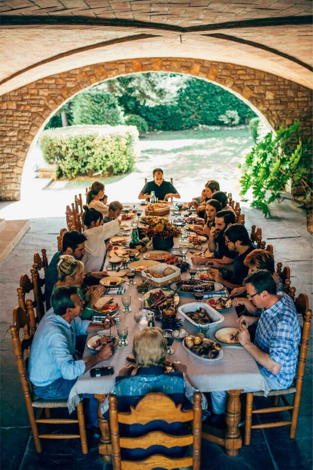
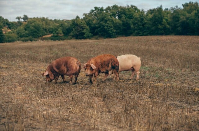
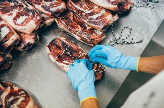

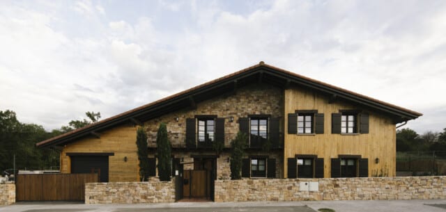
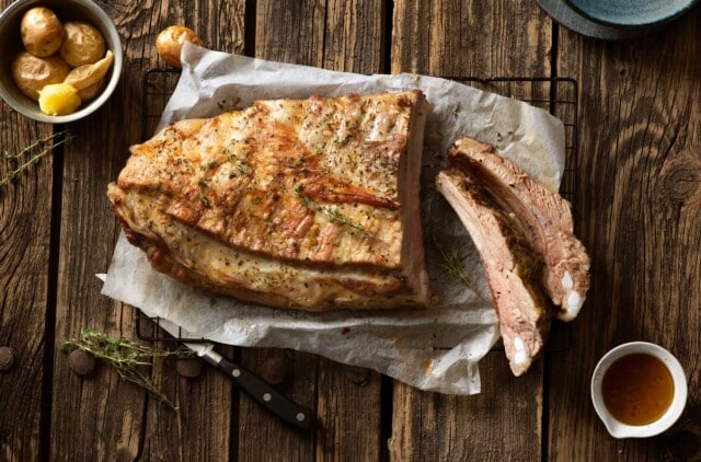
In addition to the design, we have generated textual and visual content to build the universe of D’Avinyó. The human tone of voice that we have developed with Noemí Rebull and Pol Alert conveys the closeness that characterizes the family. In addition, with Leo García and Anna Pla Narbona, we portrayed its history and day-to-day life from a documentary perspective. Together with Jordi Balcells, we portrayed the product in a rustic Mediterranean-inspired environment that brings warmth to the product.