We won the competition to develop its rebranding and redefine its strategic positioning –a job we did, jointly, with Norberto Chaves. We generated a visual language that conveyed the quality of the brand in a contemporary way. And, at the same time, make it recognizable and adaptable to all its product lines.
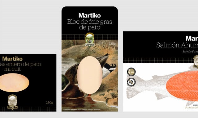
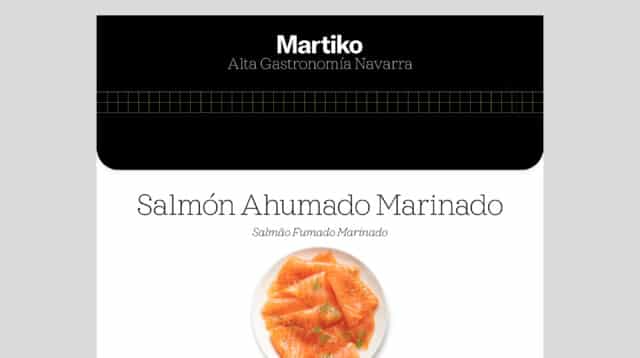
The logo, composed with America typeface, guarantees the visibility of the brand on all media. Its sober and timeless character allows it to adapt to all kinds of declinations. To name the product, we use a second typeface that is very legible and has friendly shapes that contrasts well and refers to the world of gastronomy.
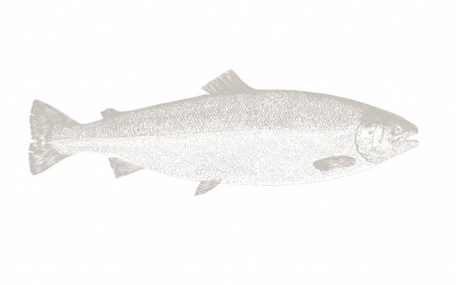
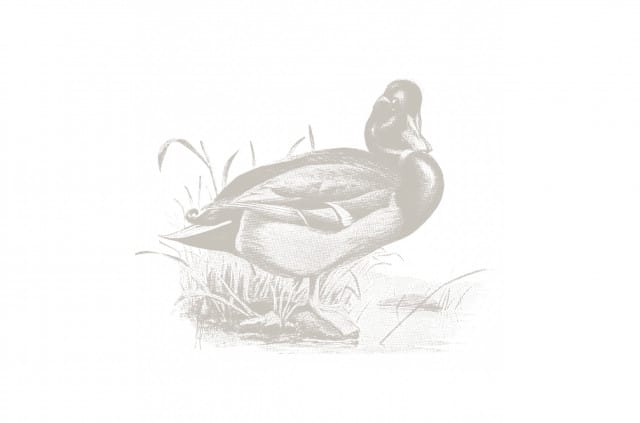
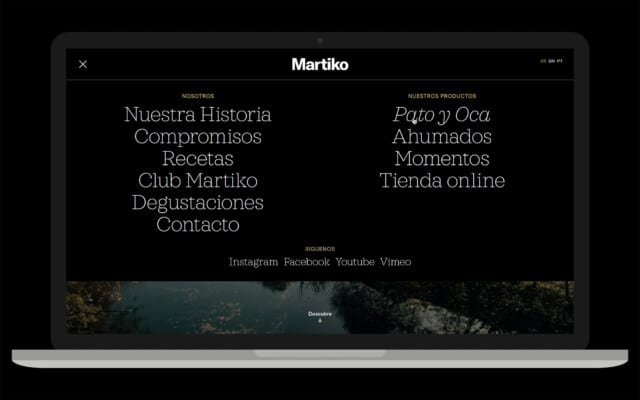
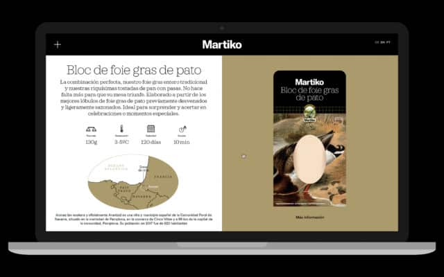
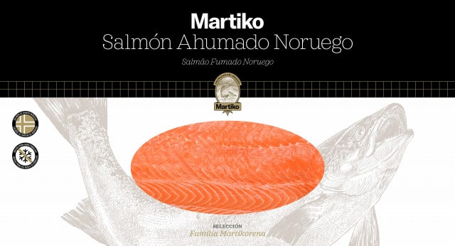
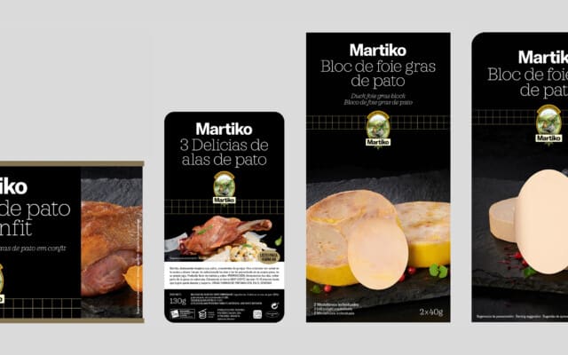
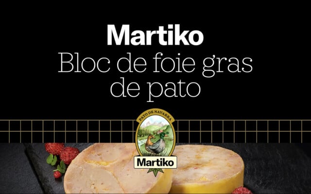
In the redesign of the visual language, we kept two previous elements that we considered important: the illustration of the brand, which we turned into a seal of quality, modernizing its form; and the grid, a very recognizable indicator of quality, of which we systematized the use. In addition, we generated a short and memorable descriptor that linked the three main axes of the brand: Premium, Product and Origin.
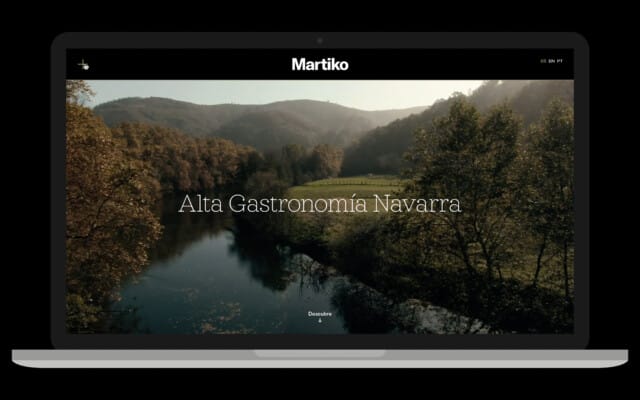
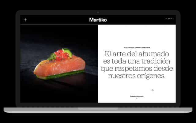
The visual language extends to all pieces of communication, whether digital or printed, generating a solid and recognizable universe.