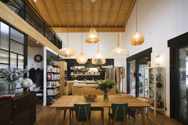
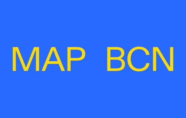
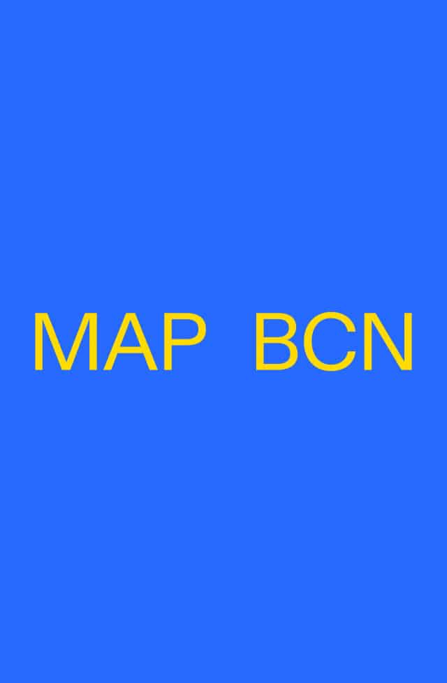
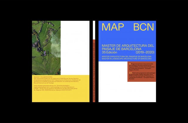
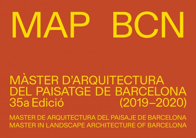
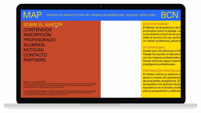

One of its main problems was that it did not have a name that differentiated it from the rest of the master’s degrees on the same subject. For this reason, we created the acronym MAP BCN, from which we designed the brand.
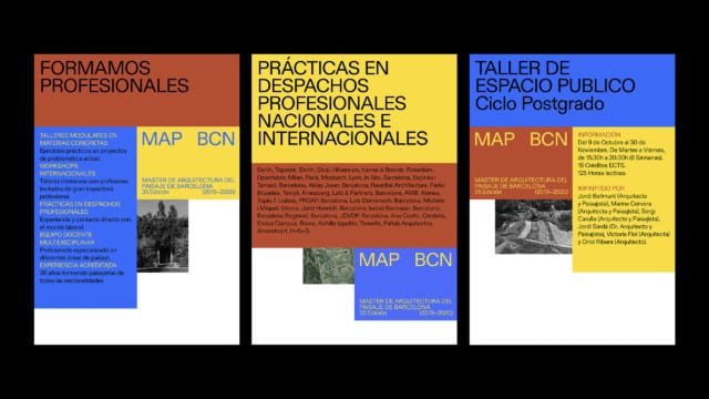
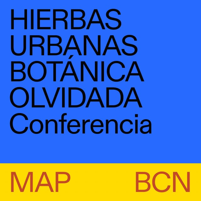
We based the identity on the idea of ‘space under construction’ (that is, as a living entity and in permanent definition). We generated a visual language with which we treat the formats as if they were architectural plans –dividing them into modules that are information containers. The resulting irregular empty spaces give the pieces an incomplete look in line with the concept.
The School has a language that can be applied in an agile and autonomous way, based on the use of typography and colour.