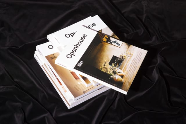
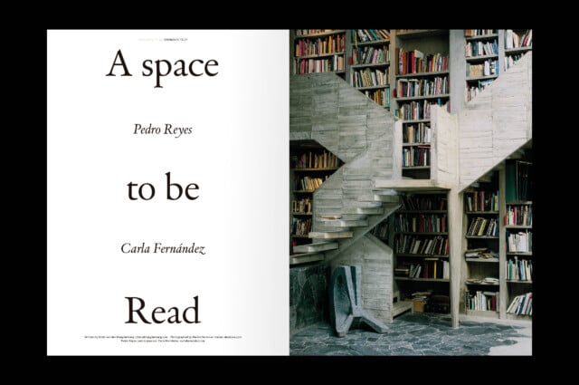
We took charge of its redesign generating a language that, with a classic and quiet tone, prioritizes its visual content. Combining a classic Roman typography like Van der Kere and a modern grotesque like Plain, we designed a system that, with prominent whites, maintains a clear essence –and, at the same time, is versatile enough to adapt to its contents.
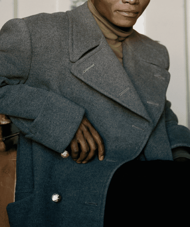
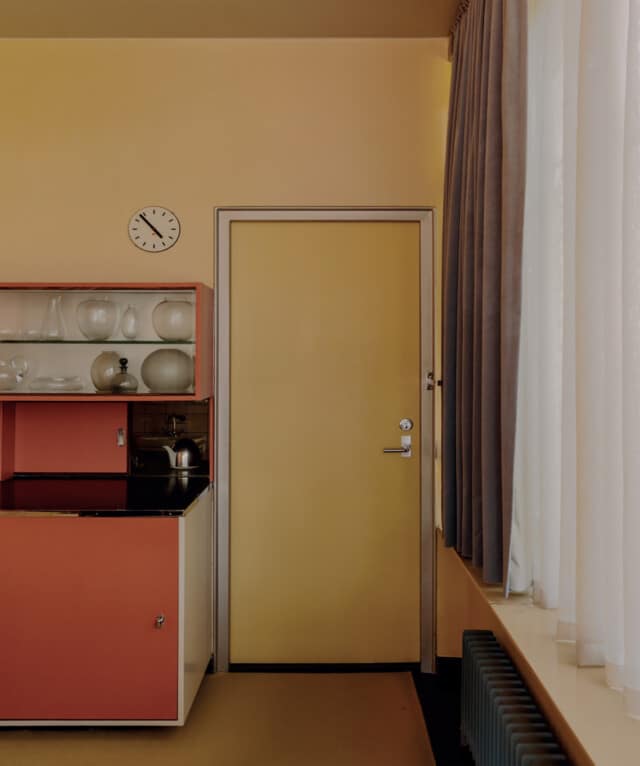
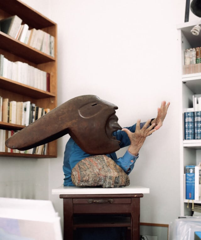
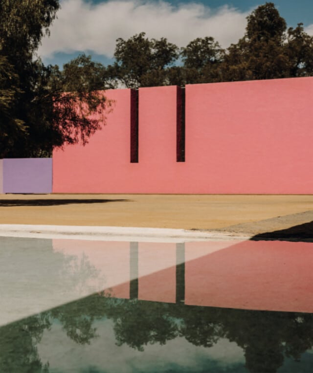
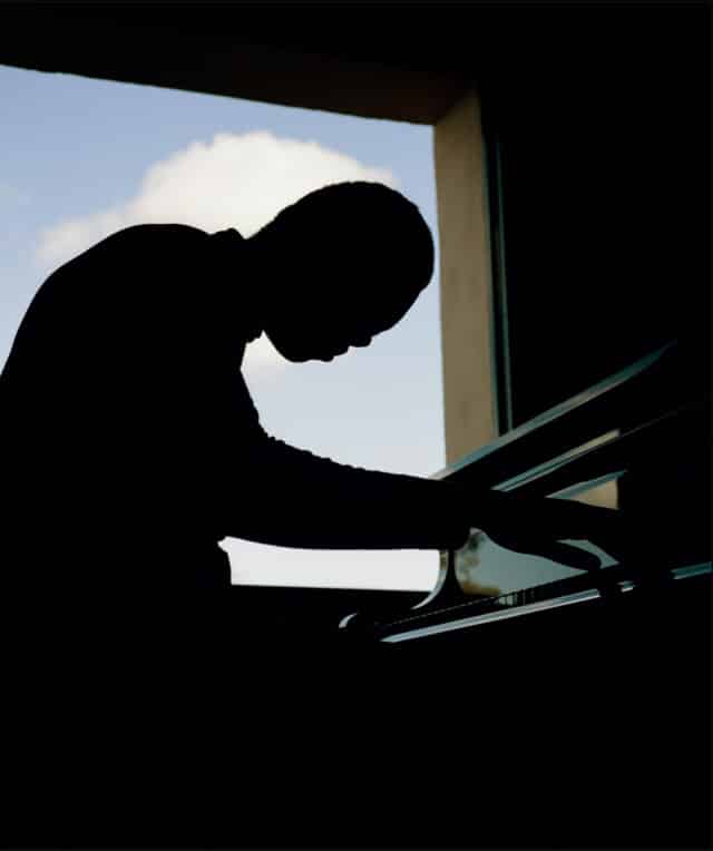
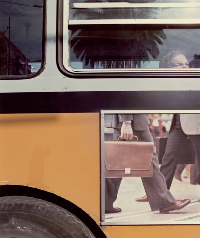
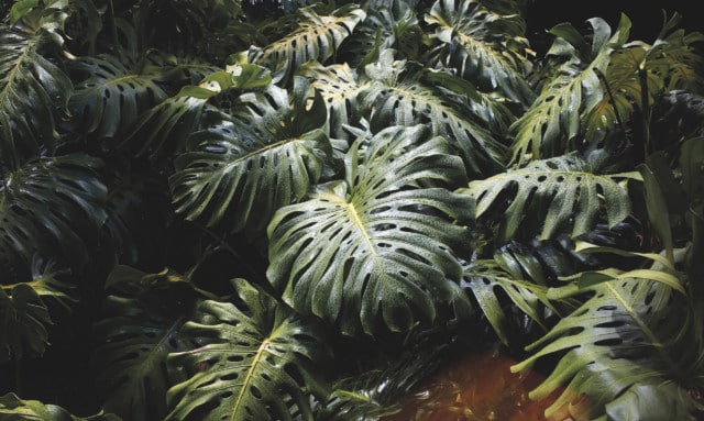
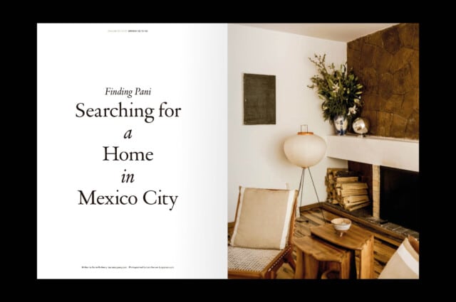
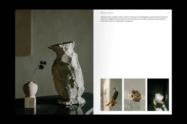
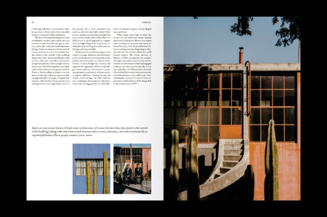
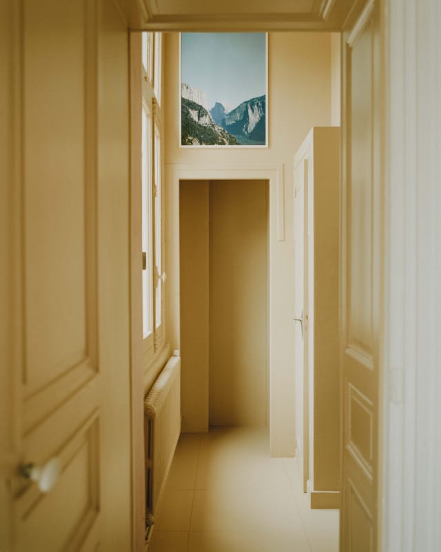
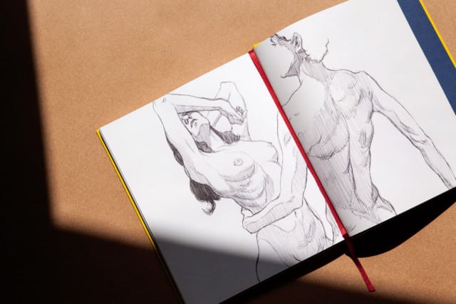
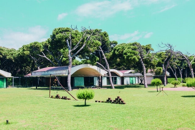
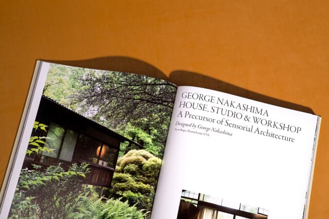
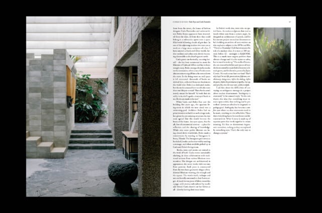
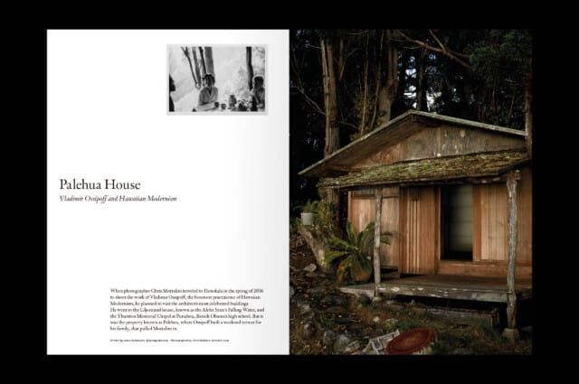
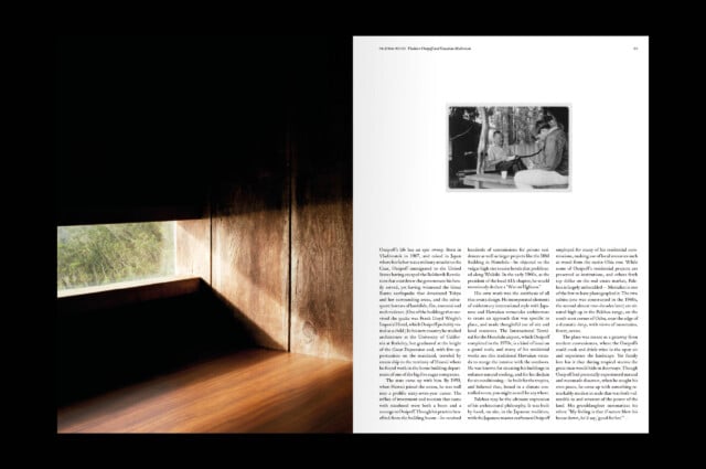
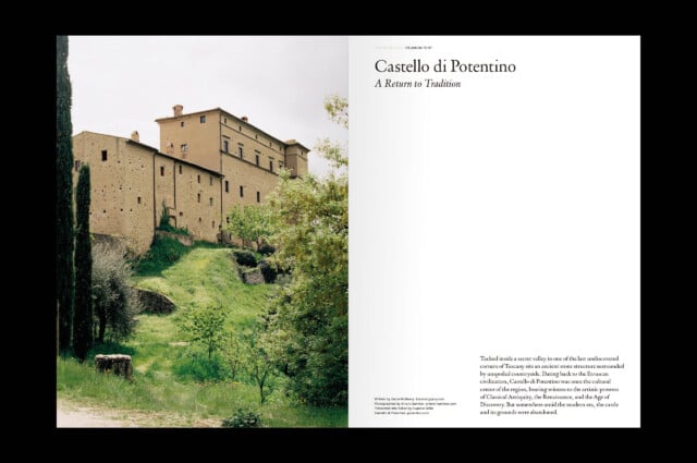
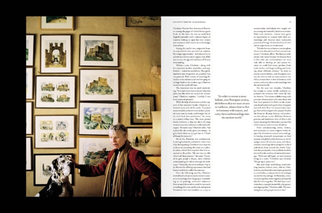
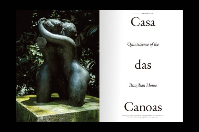
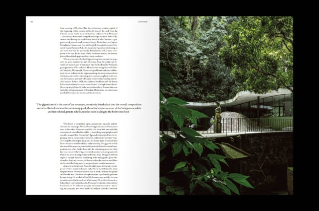
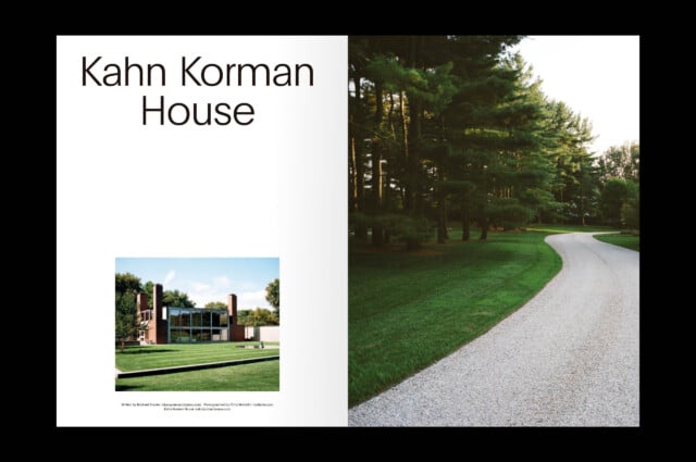
The selection of images for the articles, which we do together with co-founder Mariluz Vidal, suggest its atmosphere through light, color, textures or materials, far from showing the house in a documentary way.
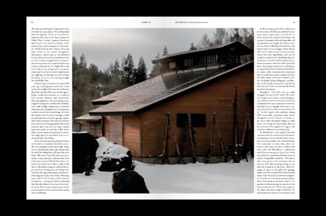
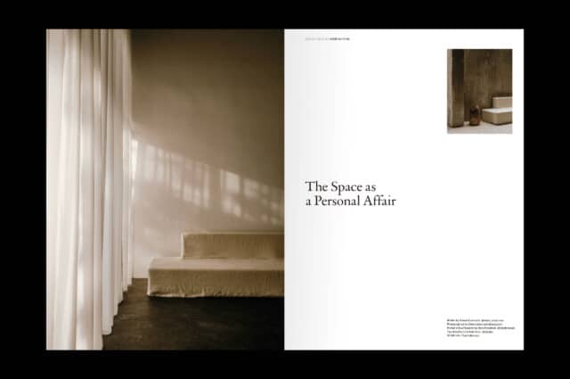
The selection of images for the articles, which we do together with co-founder Mariluz Vidal, suggest its atmosphere through light, color, textures or materials, far from showing the house in a documentary way.
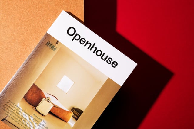
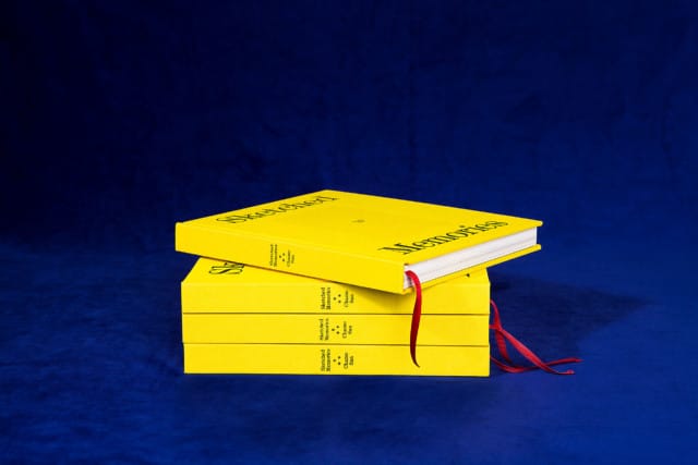
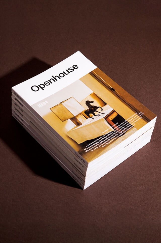
The paper, printing and color range contribute to the serene feeling of the magazine and the quality of its contents. The format and the embossed paper of the cover make it flexible and manageable. And, at the same time, they give it identity.