La Casa dels Clàssics
An identity of classic spirit with contemporary ways
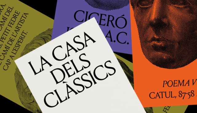
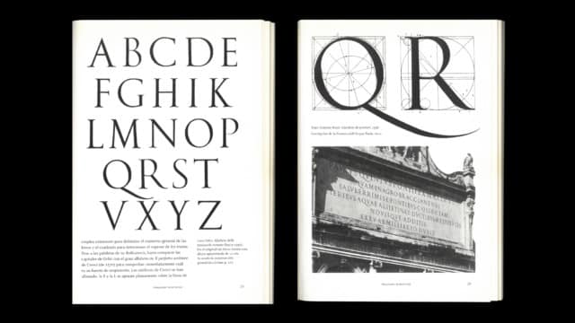
Typography is the central element of an identity that reflects the humanistic character of the project. Louize is a current revision of Trajan, a typeface based on the cut inscriptions on Trajan’s Column, bringing the idea of ”contemporary classic” to the visual language.
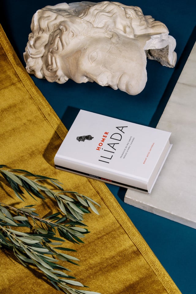
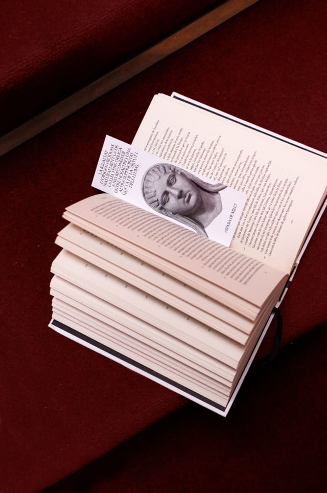
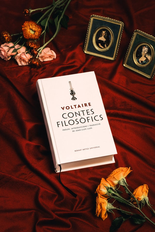
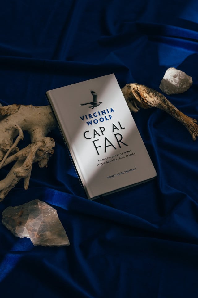
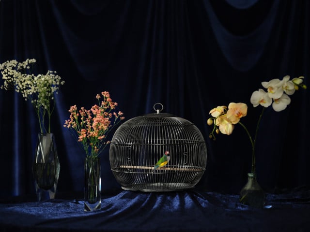
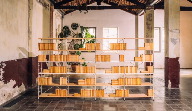
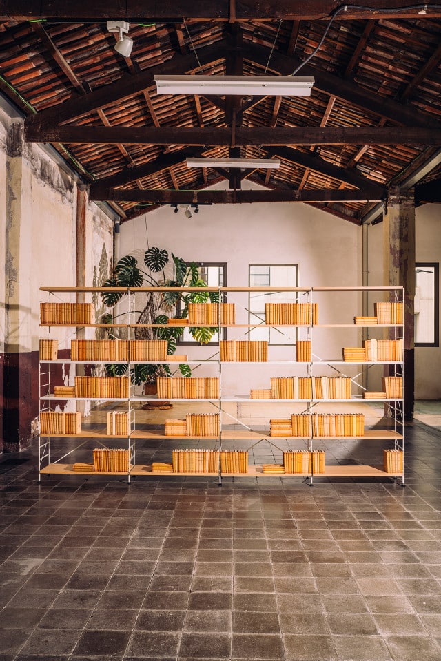
We were commissioned to photograph a collection that had been previously designed. With Leo Croma, we portray the books surrounded by classical reference elements that contrast with a contemporary treatment of light.
The website is an e-commerce where animations, overlays and rounded corners give a dynamic and digital character to its classic and editorial content.
Visit the website of the project.
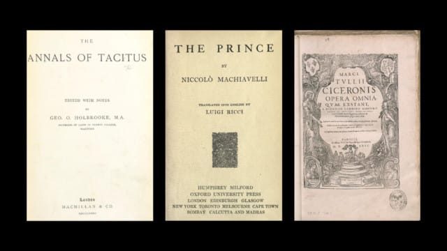
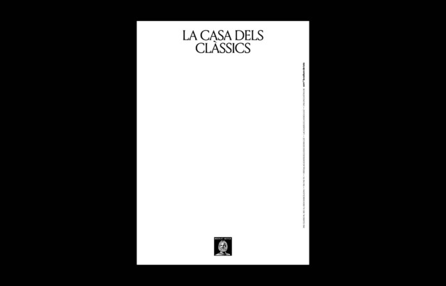
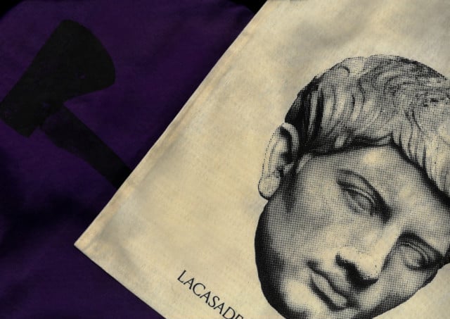
The vertical composition, where the name and symbol frame a content that is always in the upper case, takes the design of Renaissance books as a basis and represents the institution as a framework that accommodates a wide variety of content and disciplines. The visual language includes a color palette reminiscent of the ancient world and dot-screen photography that relates to turn-of-the-century publications. When we use portraits, we stretch them to the limits of the format.
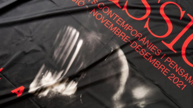
One of the main initiatives of the entity is the Festival Clàssics, where contemporary artists review classic works with a common theme that varies in each edition. From the studio, we conceive and design all its communication campaigns.
