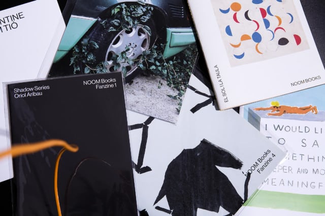
They publish digitally and in short runs according to demand, in Catalan, Spanish and English. That is why we designed an identity that, in addition to reflecting the tone of the collection, can include a large number of issues and is easily adapted to the versions in both languages.
The typographic composition in left and right boxes generates a free code, close to the world of posters or campaigns, which gives shape to a series that has a wide scope.
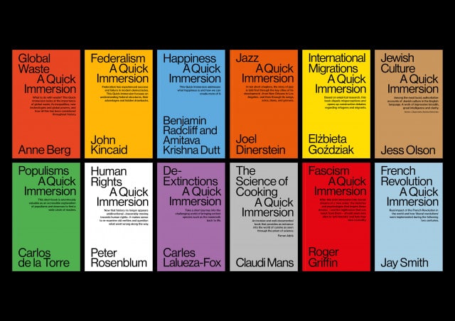
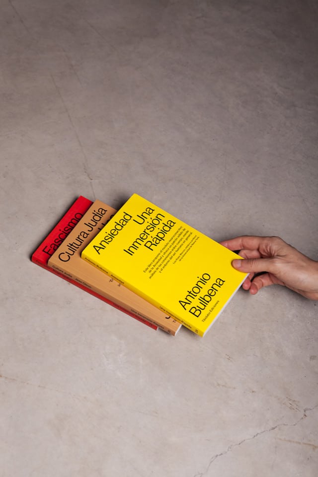
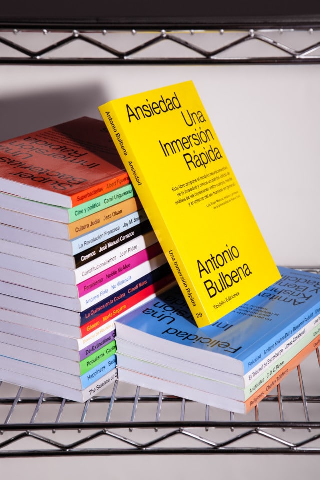
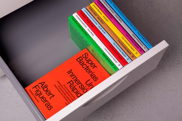
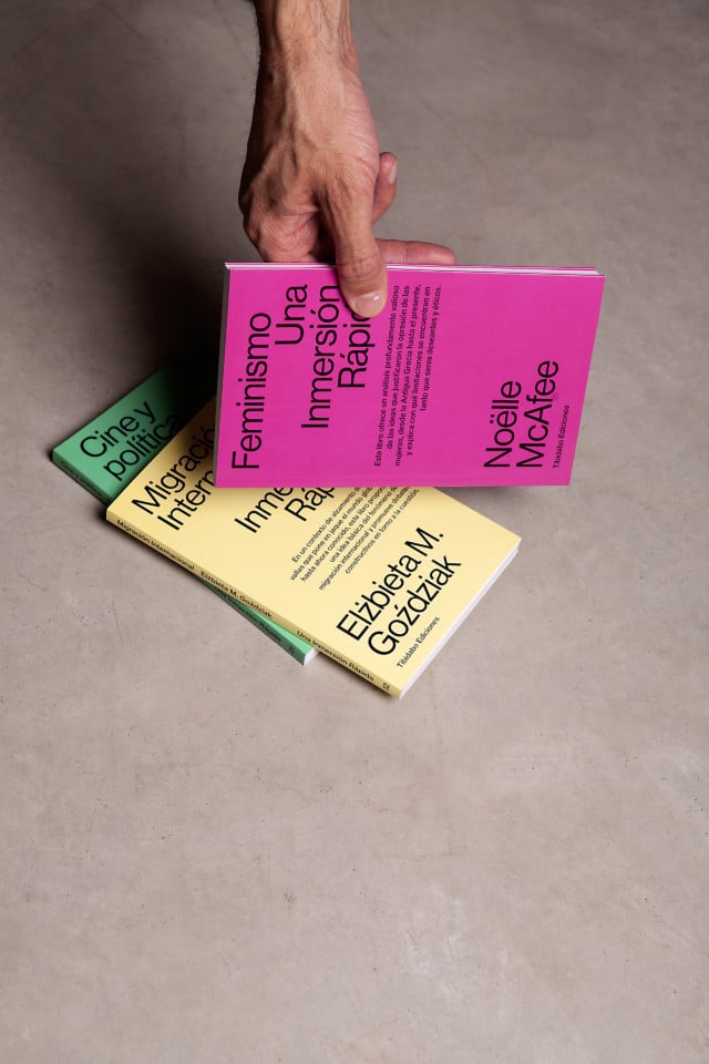
We based its design on the use of a single typeface, a single weight and a single body, which we combine with an open color code. In this way, we give each book its own identity and, at the same time, link it to the rest of the collection.